No products in the cart.
Content Marketing
How We Designed (And Redesigned) Our Interactive Newsletter
18
May
May
As you probably know, here at Rock Content we aim to bring only what is relevant to marketers and brand owners.
And, like many brands, we have a weekly newsletter to deliver to our readers, straight to the point, everything that happened during the week and how each topic impacts their strategies — we rely on the point of view of our experts in each subject for this.
What sets The Beat apart from any other marketing newsletter, however, is that it is a completely interactive newsletterbuilt on a platform made for this.
I’m a designer here at Rock Content, and I’m responsible for building The Beat’s interactive editions every week (yes, designer. Not a programmer, not an IT professional. I swear I only know a little bit of HTML and CSS) .
As I know that the interactive newsletter concept is not so popular, and that perhaps many marketers wonder if it is possible to bring this to their own brands, today I’m going to tell you a little bit about the backstage of The Beat’s production: how the idea came up, which tool we use, what the weekly production process looks like and, extra, why we updated the project in January 2022.
Shall we?
The first sketches of our newsletter
The first issue of The Beat was released in January of 2021, but before that first one aired, a lot happened.
The project that inspired the creation of The Beat was The Weekender, from The New York Times. It’s a project that brings together eleven articles selected by editors of the NYT with news to enjoy over the weekend.
When developing our newsletter project, our objectives were clear:
- reach a new audience;
- diversify our content production;
- produce rich and strategic content;
- use Ion in a new format;
- produce weekly releases.
Oh! Ion is Rock Content’s platform for creating content and interactive pages, and the tool we use to build The Beat on a weekly basis. I’ll talk more about that soon. For now, we continue with the initial planning of the newsletter.
Time for the briefing or the panic attack?
Defined objectives, designed project. It was time to start structuring how we would like the “face” of our newsletter to be. For that, I and the content team held a briefing meeting to align what were the expectations for the project.
This right here is usually the moment when people have amazing and really crazy ideas, and I have to say no!
At our briefing meeting we decided what The Beat project should have:
- fixed menu on the side;
- Form for subscribing to the newsletter;
- A space for the editor’s note
- Sections with a different layout: jam session, interviews, quote of the week,
- Interactivity:
- quizzes;
- reactions;
- animated graphics;
- WOW moment in the last section;
As a designer, at this point, my main concern was to develop a layout that could be easily updated and that catered for all the items that Vanessa brought.

Let’s work! Building the layout
Initially we thought of using one of the Ion templates. But as this project is very personalized, I realized that the best option was for it to have its own layout.
My process
For me, it’s much easier to create and visualize the layout when I draw it in my notebook. Let’s say I make low fidelity mockups.
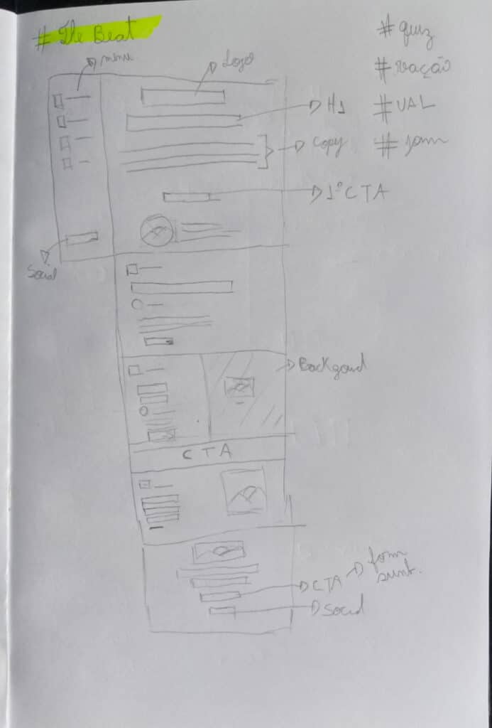
As you can see, it’s not very elaborate. It’s actually a pretty simple design, but it helps me think about how to fit the different elements on the page.
Remember the list of things we decided The Beat should have? The result looked like this:
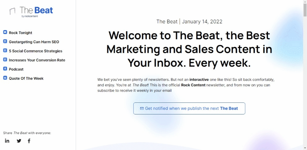
Fixed menu on the side
The fixed menu on the side was definitely one of the features that took the most work.
Ion has several features that make it easy to pin an element to the screen. So, I fragmented the layout to adapt to what we needed for The Beat, so I was able to use the tools that Ion itself offers.
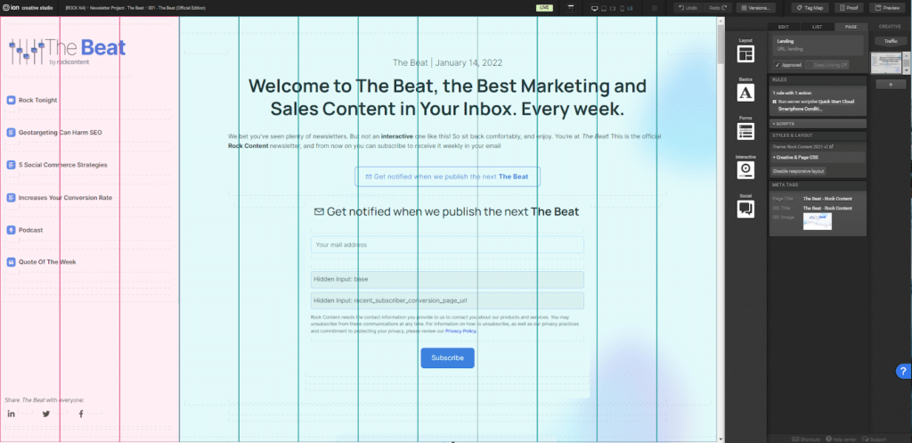
In Ion we work with a grid of 12 columns. The solution found to have the side menu was to use 3 columns for the menu, and, in the other 9 columns, build the content.
shape
There’s not much mystery here, most of our creatives in Ion have a form. We just made sure to have a message confirming that the subscription had been sent and to create a segmentation in our CRM for subscribers.
Space for the editor’s note
Right after the issue’s introduction, we have a “letter to the reader”, a few words from the co-founder of Rock Content, Vitor Peçanha.
This is an extremely simple layout. But to make it a little more attractive and dynamic from one issue to another, we customized Peçanha’s photo, our editor, with different background colors, and alternated between them each issue.

Sections with a different layout
When the beat started, we already knew that when scrolling the page, the reader would realize that the content was varied. And so we decided that the best option was to change the layout.
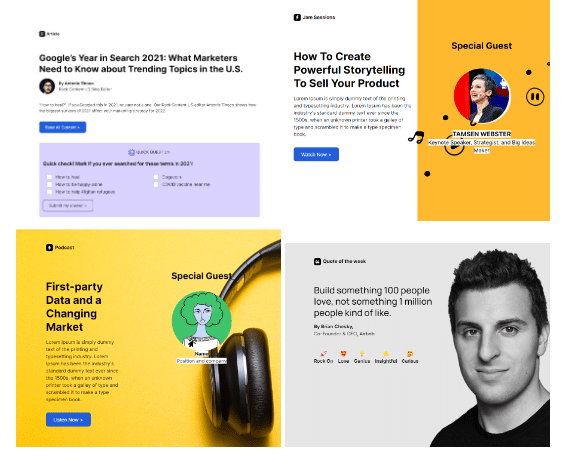
Interactivity
We are talking about Ion, rock content‘s tool that facilitates the design of interactive experiences. So, of course, we couldn’t fail to add some moments of interactivity to the newsletter.
revelation
quiz
animation
But not everything is perfect
Looking at everything we achieved, it seems that all went well in the first version of The Beat. After all, everything we had idealized went live…
Well, we managed to put 80% of it live, yes…. but, there’s the other 20%.
reactions
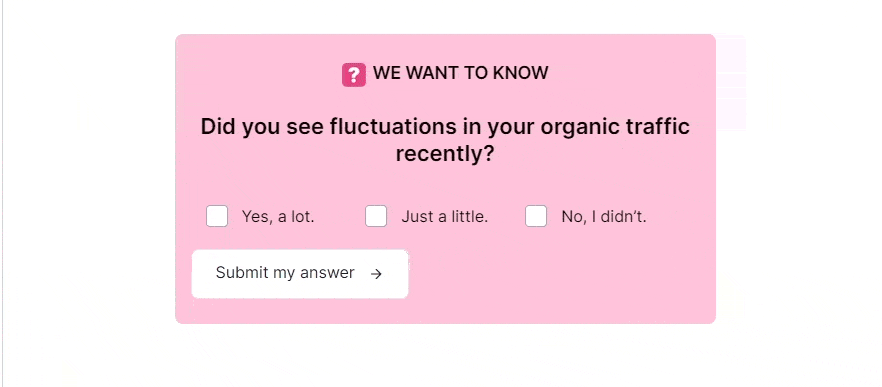
Within the “quote of the week” section, the content team wanted it to be possible to react to the content (just like we do on Facebook or LinkedIn, for example) and that, after the reader clicks on their reaction, a graph appears showing which emotion they had more interactions.
Unfortunately, in the 1st version of The Beat we weren’t able to include this. But, to continue having some element of interaction, we put emotions for people to click on, and in place of the graph with the number of clicks, we put a fun gif.
WOW moment on the last section
We needed something to mark that the reader had reached the end of the newsletter. The solution, once again, came through GIFs. We created, following Rock Content’s visual identity, four GIFs that are interspersed with each edition in the last fold of the newsletter.
The results? A successful interactive newsletter
On December 22nd we released a test version, promoting The Beat only to Rock Content’s internal team. We collected a series of feedbacks, made the necessary adjustments and then the first version of The Beat in English for the general public was released in January 2022. The Portuguese edition was released a while later, in March.
Throughout the year, we brought gradual improvements, observing the behavior of readers within the page through tags in Ion (another point for interactivity: we were able to know exactly how people are behaving on the page, collect data through quizes and, thus, to be more assertive with each edition). I even passed the baton of building the weekly page to another designer on the team, once the template was ready and easy to replicate.
At this time, The Beat was consolidated. We went from less than 15,000 subscribers adding native audiences in Portuguese, English and Spanish, to a community of more than 90,000 professionals around the world who follow what matters most in marketing, content and sales on a weekly basis with us.
In December 2022, I took over The Beat again. And after a year, it was time to officially revisit our newsletter’s base template and understand what still made sense, and what could be improved.
TheBeat 2.0
We published the new version of The Beat in January 2023. Our main goals with this optimization were to improve the mobile experience and have a template that was easier to update on a weekly basis.
What has changed:
The mobile version has been 100% redesigned. Font, spacing, menu…
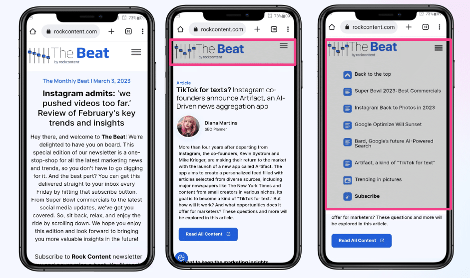
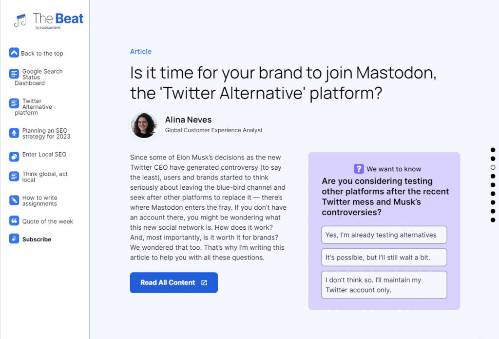
The desktop layout has also been optimized. Now, in most articles, we work with two columns.
In the side menu we added a “sign up” button.
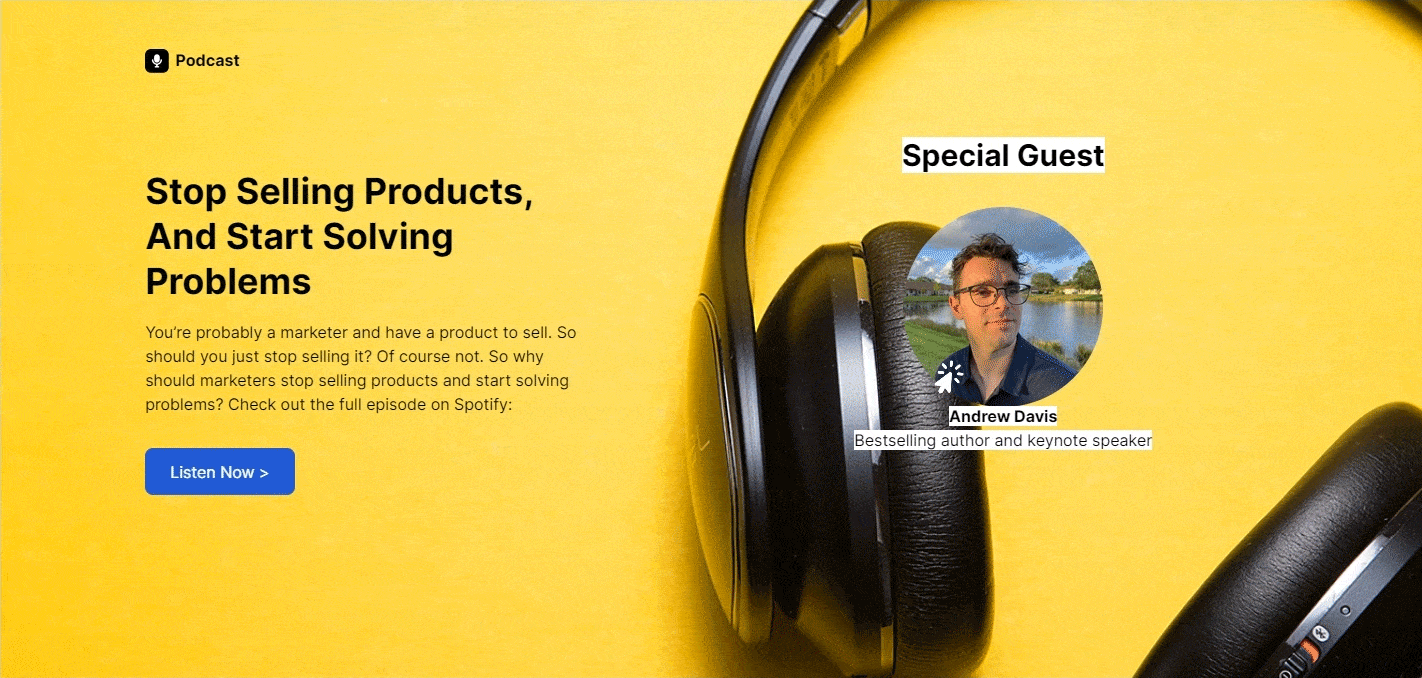
We kept the different sections of the newsletter with articles, interviews, podcasts and quote of the week.
We’ve also standardized and optimized the use of tags in The Beat. In the previous version, some edits were tagged and some weren’t.
Tags are how we can map and understand interactions within a creative in Ion. With an example it is easier to understand, right?
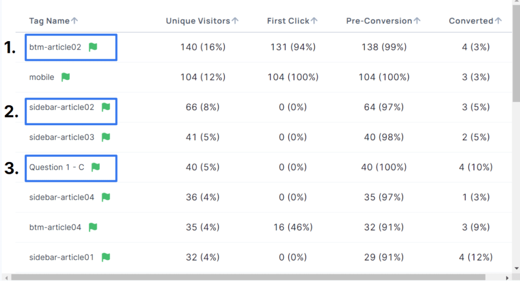
1 – Most read article
2 – In the menu, which article was the most clicked
3 – In the quiz, we want to know which alternative had more clicks
We changed the “Quote of the Week” section, as it was too complicated to find high quality photos by the authors.
Before/after
And we continue in continuous improvement.
Growing our community of professionals who rely on our newsletter to keep up with the market. Bringing an out-of-the-curve experience, unlike any other marketing newsletter, in a much simpler way than the end result makes it seem — which would never have been possible without Ion.
I invite you, if you haven’t already, to go through The Beat and experience all the elements I brought here (nothing like practice to make everything more tangible). Here you can access our latest edition.
Finally, if you also want to bring interactive content to your audience and, with that, improve the user experience and bring much more results to your brand, I also suggest that you click here to learn more about Ion and, if you want, schedule a free demo of the platform.
If you are still in doubt if interactive content really works, here are some other recommended readings to inspire you:
How I Increased an E-Book’s Conversion Rate by 20.7% Through Interactivity
Case Study: How I Increased Conversions on Ion by 431% In Only Two Months
Recent Data Shows Interactive Content Can Boost Your Results [+ Free Course]
Since we are talking about The Beat, how about subscribing? There, you’ll find all the trends that matter in the Digital Marketing landscape. See you there!